
If you know this, you can become a master of color! How to coordinate colors
We choose colors in a variety of situations, such as the color of our clothes every day, decorating our rooms, and giving gifts to loved ones. 
Then, sometimes
"Each color looks beautiful, but when you combine them together it's different than you imagined."
"The skirt I tried on before I bought it doesn't go well with the clothes in my closet."
Have you ever had a difficult time with color coordination?
There are some color combinations that go well together and some that don't.
People with good taste and a wonderful sensibility are good at coordinating colors .

To improve your color sense, it is important to learn the psychological messages of colors, how to classify colors, and how to express them . By learning these, you will be able to combine colors well and use them as you wish.
This time, I will teach you how to create a color scheme that will make anyone who sees it say, "What a great color choice!"


Basics of color theory: Hue, lightness, and saturation
To combine colors tastefully, you need to understand the basics of how colors work.
There are various ways to classify colors, but broadly speaking, there are those that classify by color name and those that use a color system that represents colors with numbers and symbols.
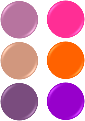
For example, even though we say "pink," there are many different shades of pink.
When classified by color name, it is expressed as "rose pink," "salmon pink," "orchid pink," and "coral pink."
Also, a color system is like an address book of colors, with each shade of pink having a symbol and a numerical value that corresponds to it.

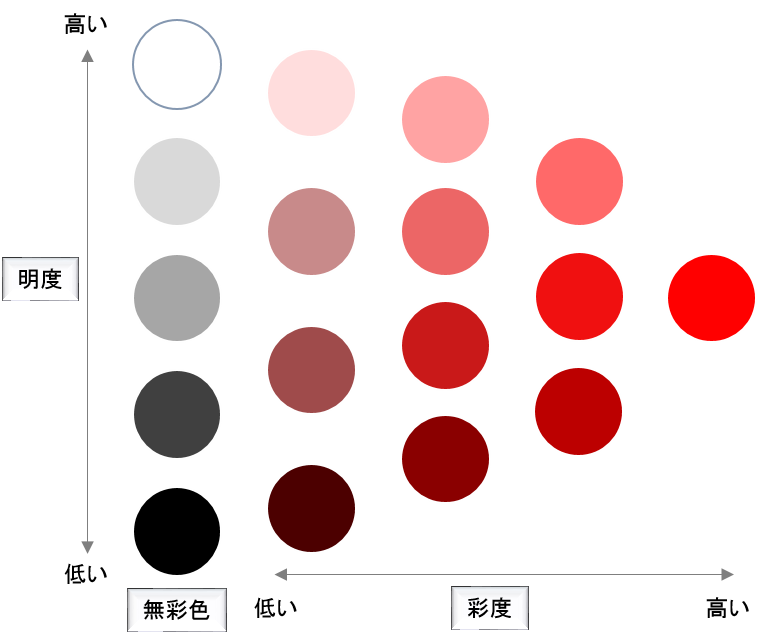
Colors can be broadly classified into "chromatic colors" such as purple and orange, and "achromatic colors" such as white, black, and gray .
Chromatic colors have three elements: hue, lightness, and saturation.
Achromatic colors have no hue or saturation, only value.
Hue
Hue refers to different shades of color, such as red, yellow, and blue.
for example,
1) Light blue like the sky on a sunny day
2) Blue like the color of the sea
3) Navy blue like the night sky
...These are all the same hue of blue. 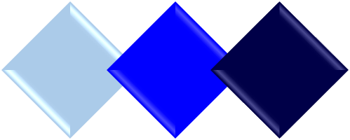
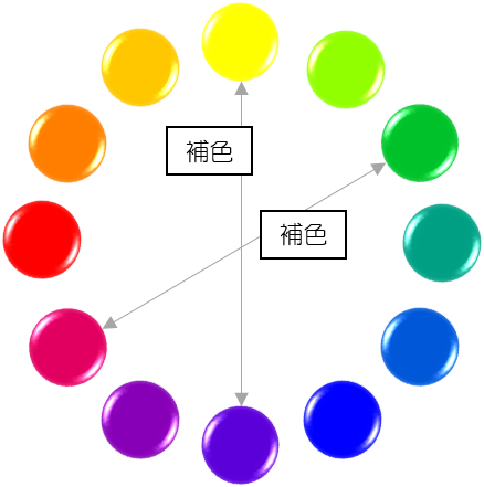
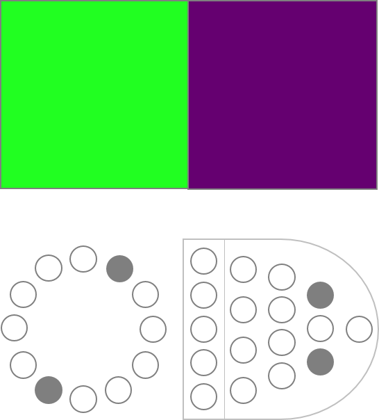
A color wheel is a circle where similar colors are placed next to each other, like the arrangement of a rainbow, with gradually changing hues: red, orange, yellow, green, blue-green, blue, red- purple , etc. 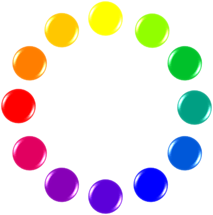
On the color wheel, colors that face each other are called complementary colors .
For example, orange and blue, and yellow-green and purple are complementary colors.
Two complementary colors have the largest difference in hue and bring out the best in each other.
brightness
Brightness is the degree of lightness of a color .
The closer to white a color is, the higher its brightness is, and the closer to black a color is, the lower its brightness is.
Pastel pinks and creams have a high brightness, while dark navy blue and moss green have a low brightness.
Monotones of white, black and gray are elements of brightness only.
Saturation
Saturation is the vividness of a color .
The more vibrant and strong a color is, such as a bright orange, the higher its saturation is, while softer, more subdued colors, such as a soft beige, have a lower saturation.
Monotones like white, black and grey have no saturation.
Basics of color theory: Capturing colors through images
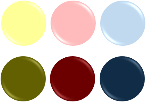
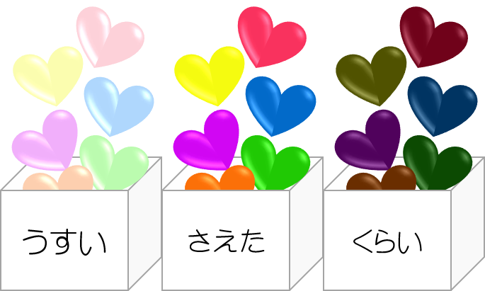
Brightness + Saturation = Tone
There is a way to express a color by combining two attributes: lightness and saturation.
The combination of brightness and saturation is called color tone .
This has the effect of making it easier to convey the impression or image of a color in concrete terms.
For example, light pink and light yellow-green have different hues, but they have similar brightness and saturation, so they share the common impression of being "light."
Using tone not only makes it easier to convey your image to others , but also makes it easier to express the atmosphere or image you want to create using key words .
When you want to create a unified image with multiple colors, using tones will help you bring them together neatly.
Red, blue, yellow... Know the images associated with colors
Each color has an associated image that many people have in common, such as an emotion, an abstract image, or a concrete object in our daily lives .
By making good use of the psychological effects of color in this way, it becomes easier to visually convey what you want to say to others and the image you want to create.
When choosing a color, it is recommended to incorporate the image you want to convey or the meaning you want to convey.
★Orange: warm, cheerful
★Yellow , bright, joy
★Green , calm and natural
★Ao cool , sincere
★ Purple: Unique and mysterious
★Pink: Cute, gentle☆White: Neat, pure★Black: Luxurious, modern
Applying color theory: Combining colors
The combination of two or more colors is called a color scheme .
There are tricks to combining colors well.
Knowing the rules of color schemes will make it easier to visualize your ideas, make them look more stylish, and allow you to use colors according to your purpose.
First, let me introduce two typical color schemes.
There is a "cohesive color scheme" that groups similar colors together, and a "sharp color scheme" that contrasts them to create a sense of contrast.
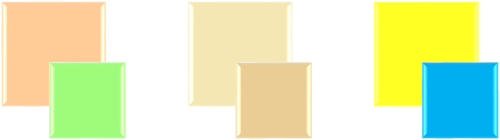
Cohesive color scheme
It is a color scheme that groups similar colors together.
Colors with similar hues or the same tone blend well together and create a cohesive color scheme.
Same hue color scheme
A color scheme that uses the same hue but changes brightness and saturation .
This color scheme is easy to create a sense of unity and is the easiest to convey the message of the colors.
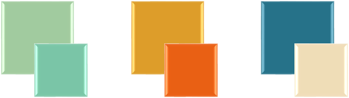
Similar hue color scheme
This is a color scheme that combines similar hues .
It's a cohesive color scheme that has some variation but also some commonalities.
Same tone color scheme
The color scheme is in the same tone .
Even though the hues are different, they are united by common keywords.
The image of the tone is easily conveyed as it is.
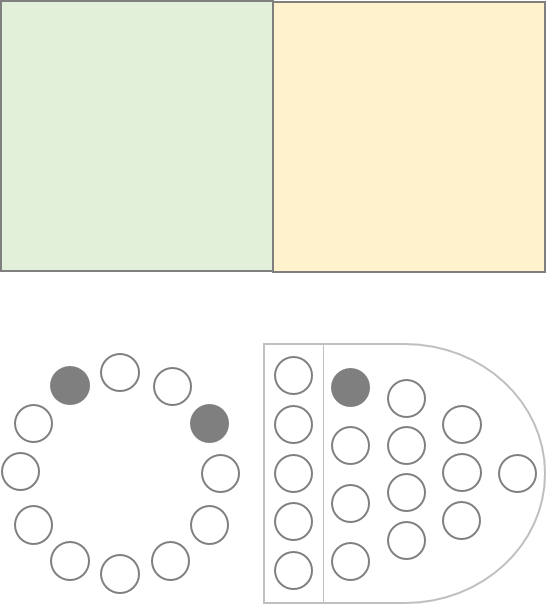
Analogous Tone Color Scheme
A color scheme that combines adjacent tones .
It's a combination that adds a little movement but also comes together.
You can make changes without changing the image too much.
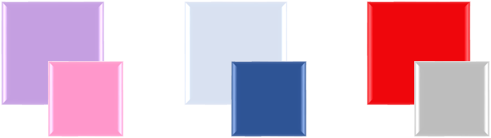
Sharp color scheme
By combining colors with opposite hues or different tones, you can create a striking color combination effect.
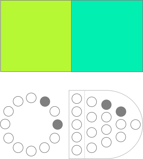
Target hue color scheme
This is a color scheme with a large difference in hue and a different image .
This allows you to create a dynamic and memorable color scheme.
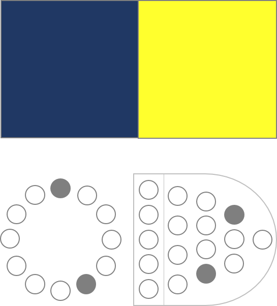
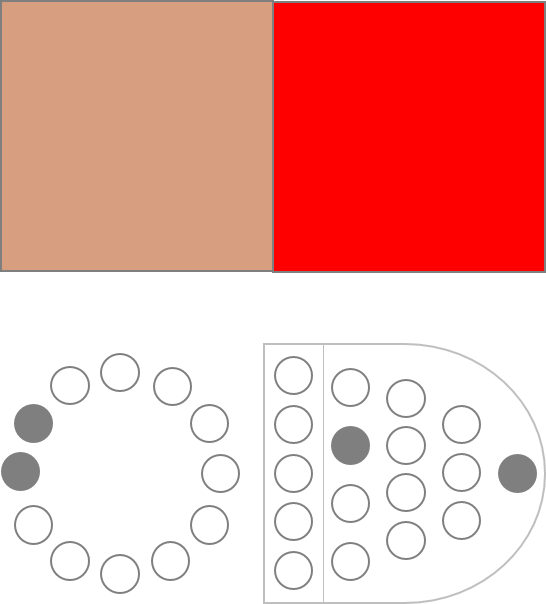
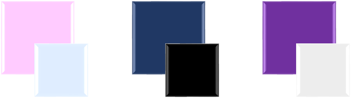
Complementary hue color scheme
A color scheme of two complementary colors on the color wheel .
It has a strong contrast effect and creates a clear contrast.
Target tone color scheme
This color scheme creates a large change in tone , with different brightness and saturation, creating contrast.
There are three ways to create a target tone color scheme:
1) Differentiate brightness
2) Differentiate saturation
3) Make a difference in both brightness and saturation
Application of color theory: Accents and separations
Even though I've combined the colors according to basic color rules, for some reason it doesn't look neat or cohesive...why?
Here are some color coordination techniques that can help you out in these situations.
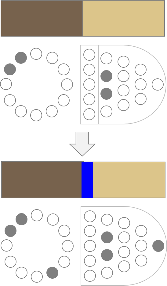
Accent Color
While a cohesive color scheme can create a sense of unity, it can also end up giving a vague and ambiguous impression.
In times like these, it's a good idea to use an accent color, which will make the color scheme look neater.
Using an accent color opposite the original color on the color wheel will tighten up the entire color scheme.
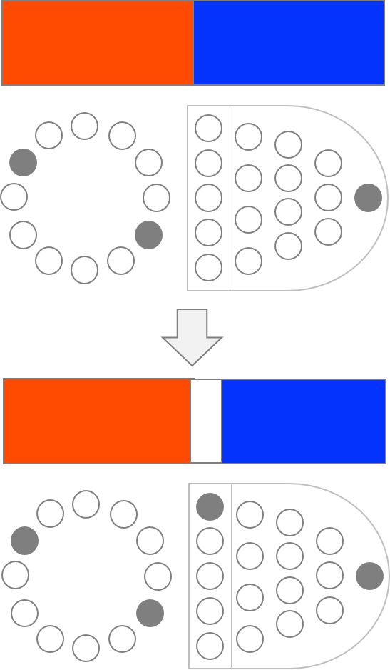
Separation
A "sharp color scheme" creates contrast and gives a strong impression. However, combining highly saturated colors can make the image difficult to see.
In such cases, try adding a neutralizing separate color .
It has the effect of breaking down strong color schemes and making them look neater.
The golden balance of color coordination
"Even if I combine colors, I don't know what colors to use or how much!"
In times like these, we recommend some color coordination methods. 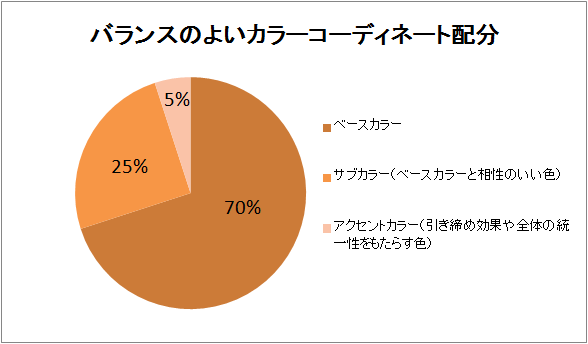
The most balanced color coordination ratio is said to be 70:25:5 .
1) First, use 70% of the base color .
2) Next, combine 25% of a sub-color that goes well with the base color.
3) Finally, add 5% of an accent color to create a more refined look and unify the overall look.
This will help you create a visually pleasing and balanced color scheme.
When combining many colors, if you feel that the colors are disjointed or not harmonious, pay attention not only to the color combination but also to the area of the component colors and the order in which they are arranged .
In many cases, simply changing the area ratio can make the image look neater and easier to see.
Improve your sense of style!
If you want to incorporate colors that suit you better, first try the personal color diagnosis in this article .
You'll quickly find out which seasonal colors suit you best - spring, summer, fall or winter.
● For spring type people
Cohesive color scheme
Enjoy a soft pastel look that resembles the soft sunlight of spring, or create an elegant impression with light, clear shades of beige.
Sharp color scheme
Combining pop and vibrant colors creates a sparkling and bright impression.
Enjoy active color coordination that will draw out your eyes.
● Summer type people
Cohesive color scheme
Combinations of the same tone of cool pastels will make your skin look more beautiful. We also recommend light and dark shades of blue for a fresher look.
Sharp color scheme
Combine basic grey with vibrant colours to create a bright, sophisticated look.
◎Autumn
- Cohesive color scheme
Try using a color scheme with lustrous colors like autumn leaves to create a rich impression, or combine light and dark shades of similar colors to create an intelligent and stylish image.
・Sharp color scheme
The contrast between the deep colors and the soft, slightly yellowish white that Autumn is known for creates a chic, mature impression.
◎Winter
- Cohesive color scheme
The combination of pale colors with a hint of color in the pure white snow creates a clean impression. Dark colors like the winter sky are also impressive.
・Sharp color scheme
Enjoy an urban and modern look with sharp, crisp, vivid colors and monochrome color schemes.
Why not try making yourself look even more beautiful by learning the colors that suit you and color coordination techniques that will make you look stylish? 


Do you know what color suits you best?
Through a personal color analysis, we will suggest coordination that will bring out your natural charm .
"No matter what I wear, it just doesn't seem to fit right." Let's solve that problem with the power of color.