"Why do fashionable people look so sophisticated?"
One of the secrets is color coordination .
Depending on the color combination, the same item can have a completely different impression.
This time, we will explain everything from basic color matching to applied techniques that incorporate trends.


1. Basic rules for color coordination
✅One -tone outfit (similar colors)
A simple yet sophisticated look. For example, using similar colors such as beige and ivory or navy and blue creates a calm atmosphere.


✅ Use complementary colors (a striking combination)
Combining colors that are opposite each other on the color wheel can create impact in your outfit. For example,
🟠 Orange × 🔵 Blue🟡 Yellow × 💜 Purple🌿 Green × ❤️ The key is to incorporate one of the colors as an accessory to avoid the red looking too flashy.


✅ Match tones (light colors, dull colors, etc.)
For example, if you choose dull colors (dusty tones), you can create a sense of unity even when combining different colors.
2. Recommended colors for each season
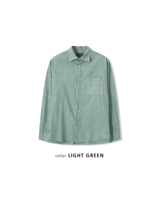
🌸Spring: Pastel colors (mint green, lavender, peach)
☀️Summer : Vivid colors (turquoise blue, lemon yellow, white)
🍂Autumn : Earth tones (khaki, brown, burgundy)
❄️Winter : Monotone and accent colors (black x red, gray x blue)


3. Color combinations for different styles
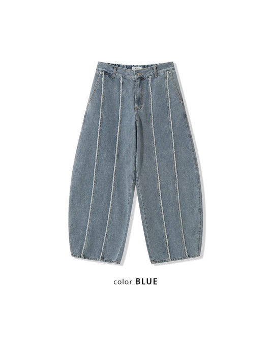
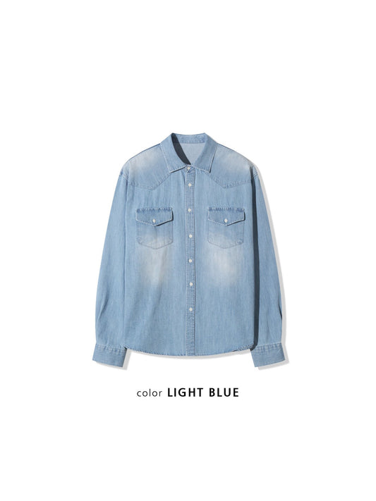
👔 Chic & Modern: Black x Gray x Silver🧥 Casual: Denim Blue x White x Camel🎨 Unique: Purple x Green x Orange


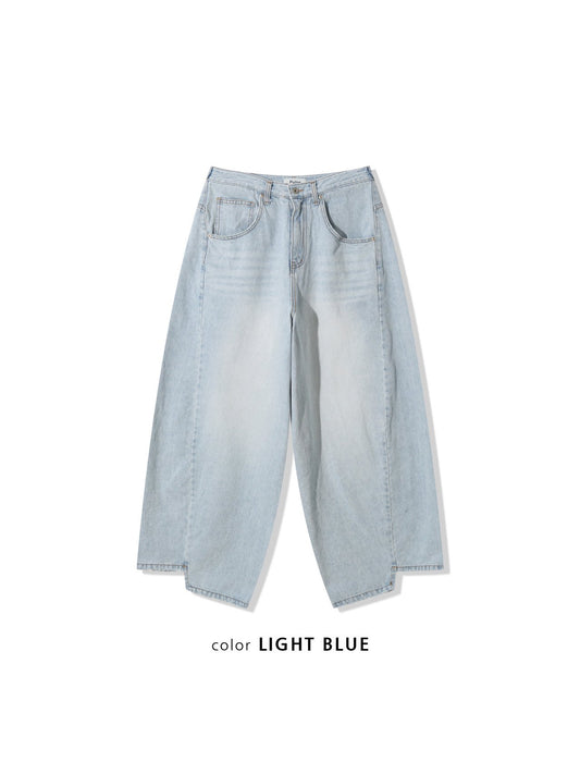
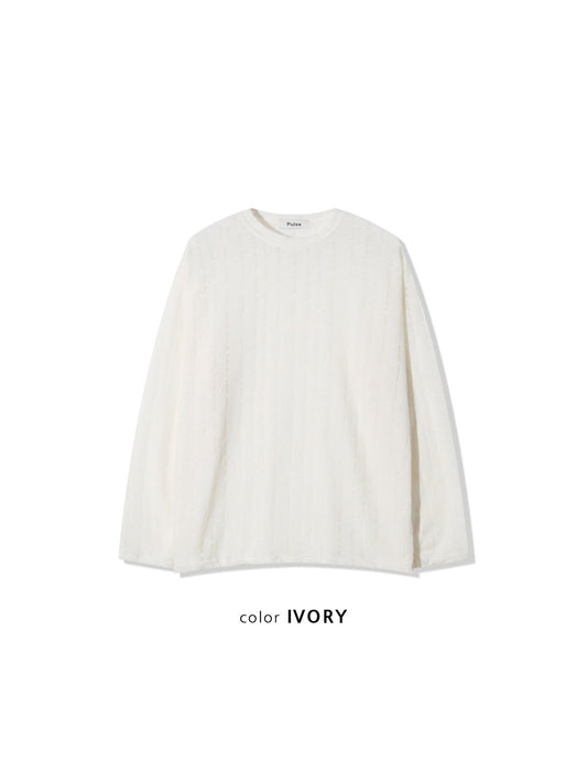
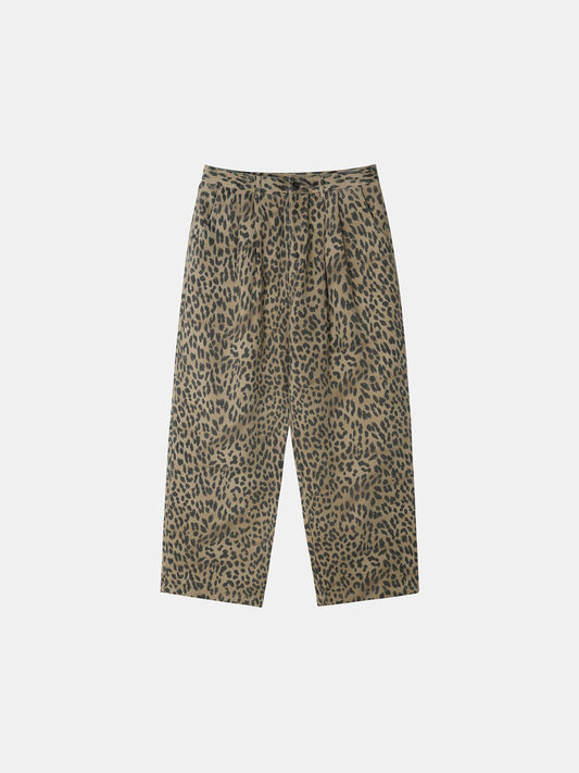
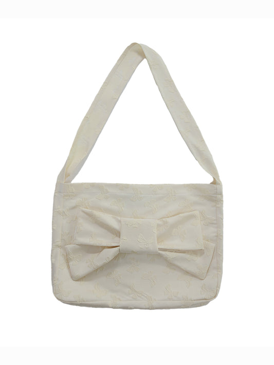
4. Recommended color styling found at WooStore!


If you master color coordination, you can enjoy fashion more freely! WooStore has a large selection of items incorporating trendy colors.
📌New items here → https://woostore.net/
Add some new color to your style. 🎨✨